Featured Artists
Featured Artist: Carlos Soca
About the Artist
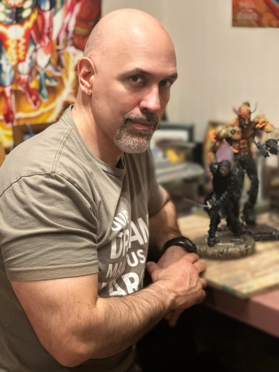
Throughout a childhood spent devouring the written word in genres and eras ranging from ancient myths and epic poems to hard science fiction and scrutinizing every type of art from comic books to the work of renaissance masters, Carlos Soca embraced growing up in New York City, where the whole world was an open book for anyone adventurous and curious enough to read it.
Case in point, when he was 8, his mom found him drawing on his bedroom wall and – mid-reprimand – caught herself when she realized he was doing a better-than-decent job recreating parts of the Sistine Chapel. “Bueno, asegúrate que lo acabes bien…” If you’re going to do it, do it right and finish strong. A lifetime spent creating professionally both as a writer and an artist has taken Carlos to many places, culminating now in the launch of his newest venture, Manifest Sculpt LLC., a studio dedicated to collaborating with clients to create bespoke pieces for their collections.
https://manifestsculpt.com/
Experience with Aves Products
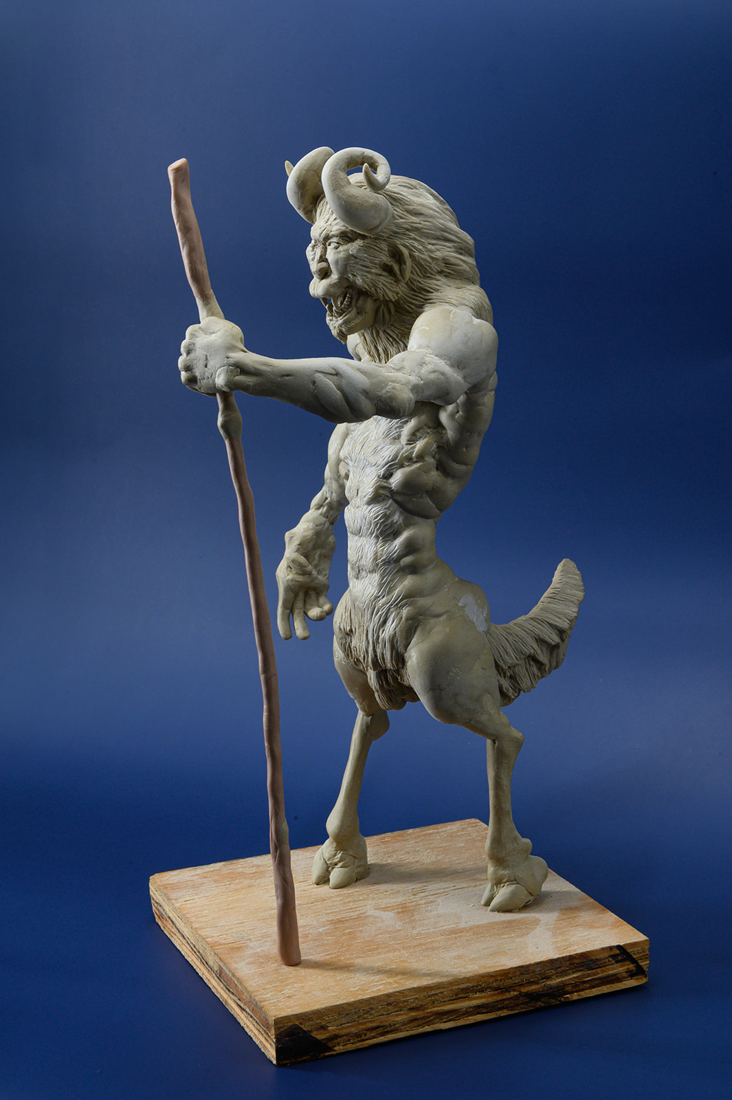
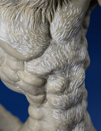
When I first decided to dedicate myself to generating one-of-a-kind editions, I researched many materials, examining their properties and testing them for their durability and ease of use, before deciding to go with the Apoxie Clay product by Aves. I wanted the first piece I attempted to make with this new material to serve as a true test of its viability—though more so, my connection with it and ability to sufficiently dominate it to make the things I imagine. This hybridized creature, which makes me think of the cool animal mashups featured in the Avatar cartoons, was an idea I had rolling around my head for many years (well before those shows were ever created), ever since I learned I was born on the cusp of the lunar new year—so I’m equal parts river goat and monkey. And so is this guy.
Later Work with Apoxie Clay
Hulk, based on original art by Jack Kirby
I wanted this sculpture to work as an individual standalone piece as well as in conjunction with the others in the series. The challenge was counterbalancing the figure to preserve the signature Jack Kirby dynamism in the pose—Hulk had to be jumping right out at the viewer, just as he is in the poster.
At the time, this was only the second piece I’d done with the Aves product, Apoxie Clay that I generally use now for one-of-a-kind pieces. Besides being incredibly durable and having a satisfying heft in its finished form, this two-part epoxy allows me to exercise both sets of sculpting skills; modeling (building up, adding on and working outward from an internal structure or armature) and carving (creating the piece by cutting away and/or engraving). Depending on temperature and humidity, the material is soft and pliable for about an hour or so, less so but still sometimes workable for another hour. After that, it must set; but after 24 hours you have a piece that can be cut, carved into, sanded etc. to add the desired detail and finish.
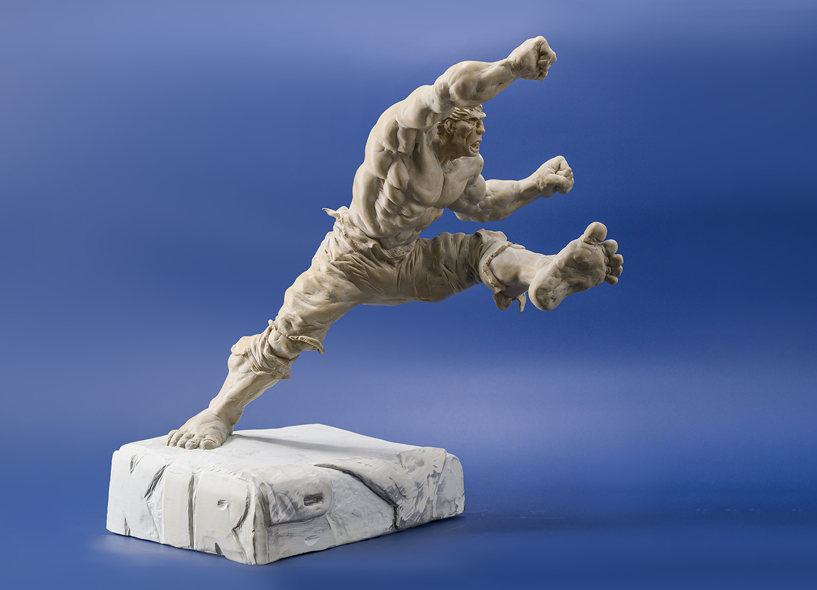
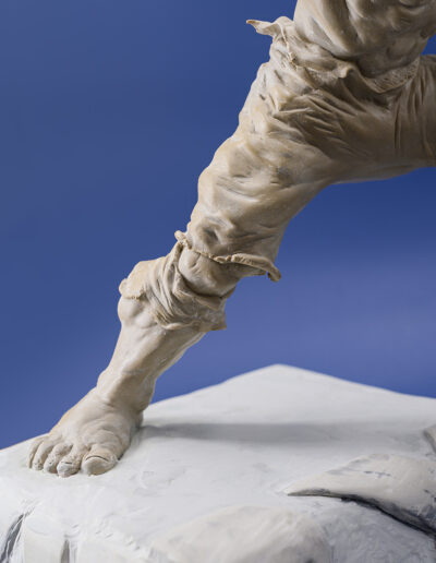
“this was only the second piece I’d done with the Aves product, Apoxie Clay”
Iron Man, based on original art by Jack Kirby
This was still in my early days of working with the Apoxie Clay, but the finish you can get with this material once it sets is perfect for the subject. Shiny metal that flexes and moves somehow? With this stuff you can feel it, not just imagine it.
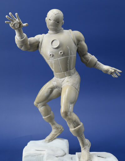
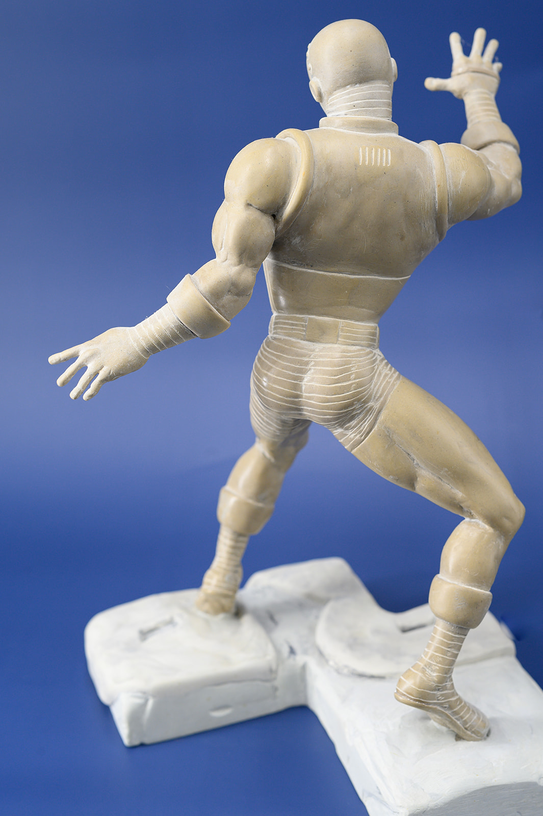
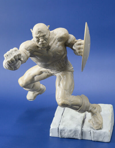
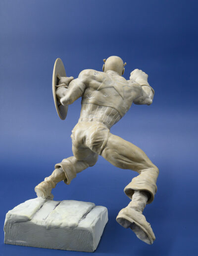
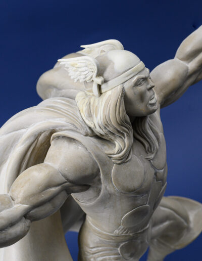
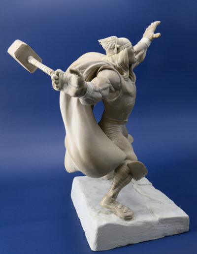
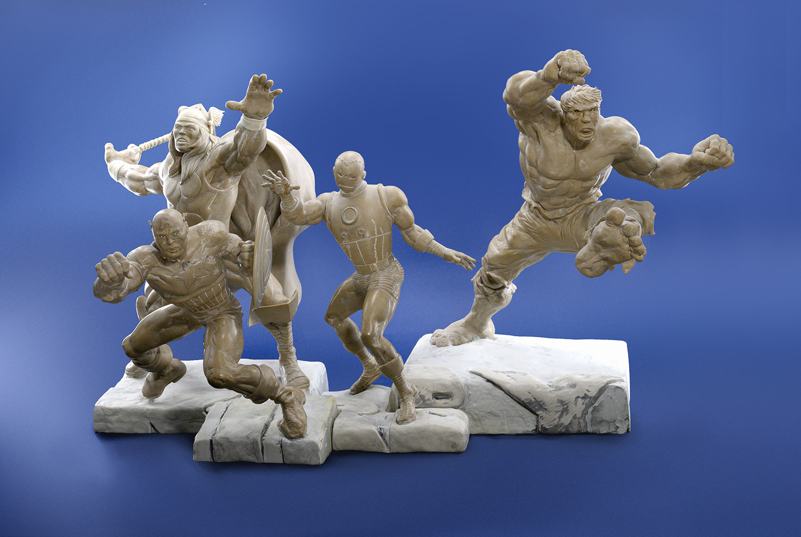
The Avengers, based on original art by Jack Kirby
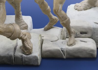
Even before I started sculpting the individual pieces, I had a plan for making sure they interlocked. The silhouettes of the bases were worked out well in advance, as was each figure’s footprint to make sure they would fit together with no individual dominating the scene. I was also careful to make sure the individual scale of each hero was correct in relation to the others—so, yes, sorry Iron Man fans, Tony is shorter than Cap, no matter who you rooted for in Civil War. And they’re both shorter than Hulk and Thor, no matter how inconsistent the absentminded Kirby was about maintaining the details of their relative scale to one another.
Along the way I decided to make the statement about the piece—front and center—so I worked in the placement of Kirby’s name, not just so you saw it on the pieces when they were joined, but on each individual piece as well. I didn’t want any doubt as to why I made these, or whom I made them for.
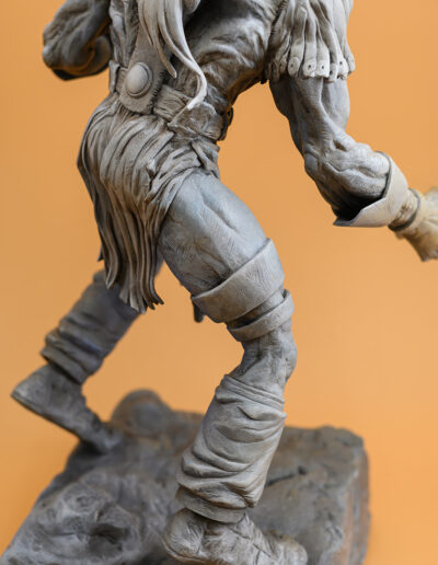
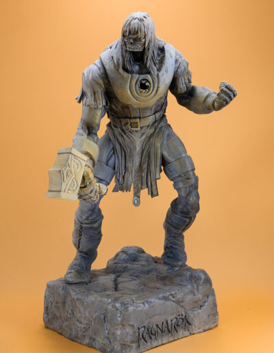
Ragnarök, based on original art by Walt Simonson
When I set out to translate a two-dimensional piece into three dimensions, I look for as many references as possible, to improve accuracy. Of course, Walt draws things differently throughout his comics because he’s focused on telling the story rather than remaining on model. When in doubt, I look for the preponderance of evidence—did he draw it more often this way, or that?
What’s much more challenging is capturing the beautiful Simonson line. Walt has a very graphic style, full of hatching, and though there are lovely sweeping arcs to describe motion, there are squared-off edges and straight lines throughout. He starts with beautiful skittery thumbnails to capture the volumes and movement of the figures and then blows them up to fill them in with the necessary details. He clearly loves line work, and every line has a purpose.
Chandani, “Moonlight”
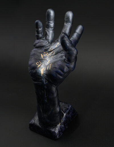
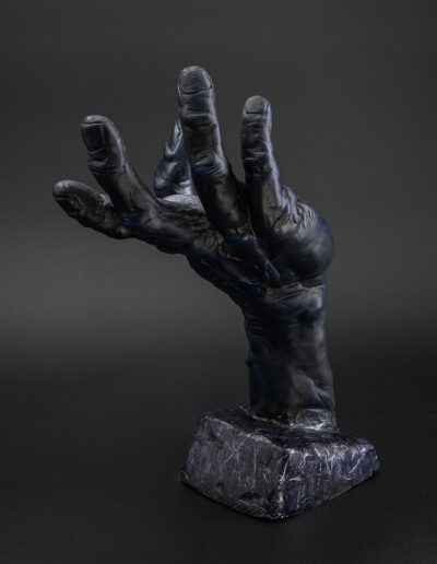
I modeled for the hand, but lest you think it’s just a simple casting—it’s twice the size of my actual hand. Besides the “om,” the other letters spell out “moonlight,” and it’s meant to look as if the hand is catching a moonbeam—a challenge to depict. But my daughter deserves no less. Much like the moon she gets her name from, she waxes and wanes, but she is constant and ever present—something that can’t be denied, even if you can’t catch her—like the light of the moon.
Fernando
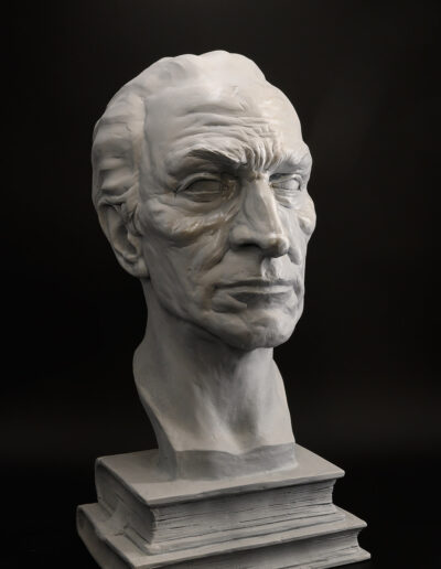
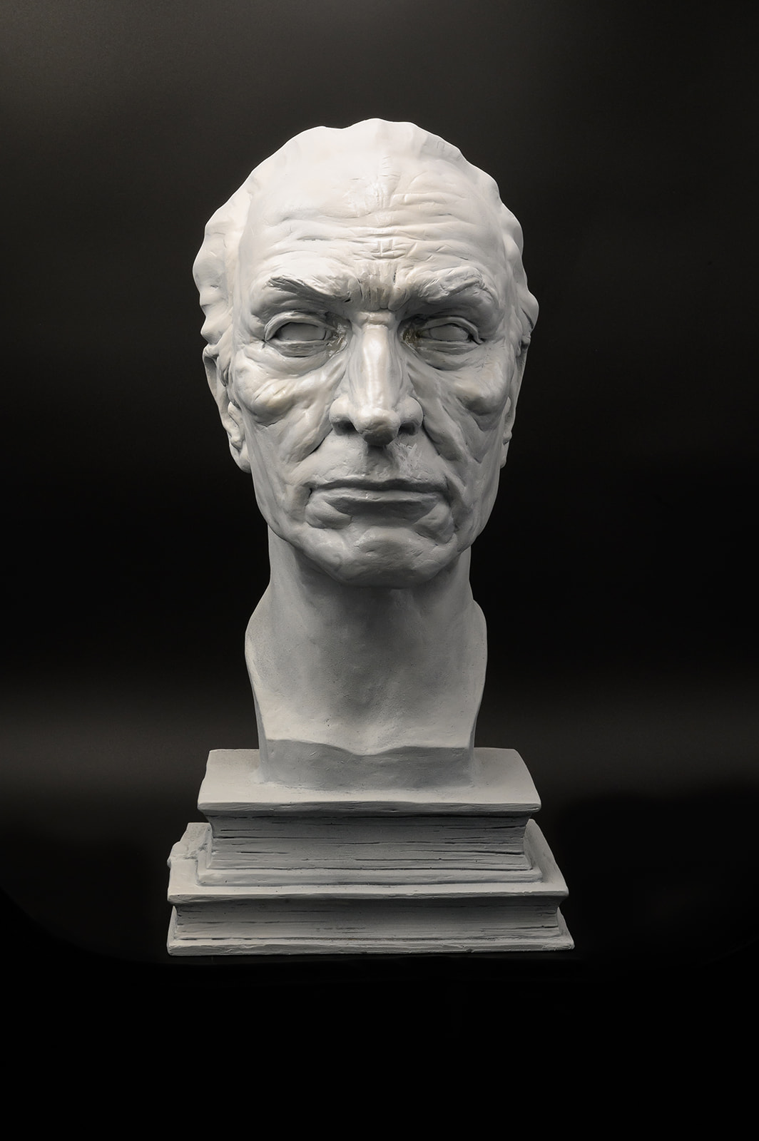
This was a true labor of love. When I’d finished sculpting, I decided to paint it shades of white and give it a faux marble finish like the busts of antiquity it reminds me of, the ones that once adorned libraries and tombs of forgotten scholars, like my poor but brilliant grandfather. The effort was well worth it. When my mom saw it, she spontaneously started to cry—and she’s no crier.
“You captured him perfectly. Ese es mi papa.”
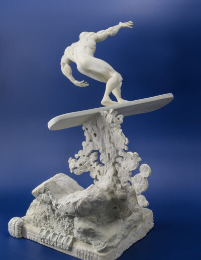
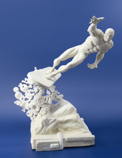
Silver Surfer, based on art by Jack Kirby
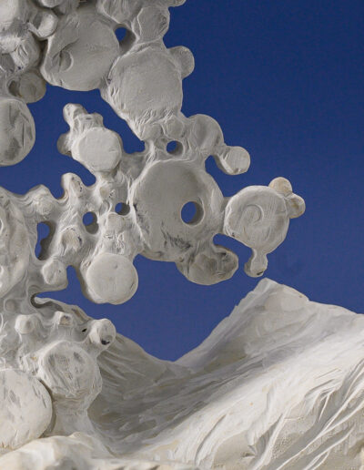
Jack Kirby was, is and will always be, comics for me. His artwork and stories have had a profound impact on my life, and I never tire of reading and collecting them, or preaching about the man and his work. Frankly, he was wronged. And whenever I’ve endeavored to make a piece based on his drawings, I feel the weight and the joy of his legacy and the connection we, his fans, feel to it.
That said, it’s tough to translate the man’s work into sculptures. Really tough. Like when you want to sculpt Kirby Krackle.
His figures are incredibly dynamic, capturing amazing, exaggerated poses with the fewest possible marks. The style is instantly recognizable, and it seems so simple… until you try and copy it. The goal is to be as faithful as possible in interpreting every line, every gesture, every grace note—no matter how abstract—preserving not just the essence, but the actual work. I don’t want the sculptures to be Kirby through a “filter.” I want it to be as close to pure KIRBY as possible. It isn’t easy. But the King is worth it.
Coming Soon!
Carlos will be publishing a book of his work later this year. “Editions of One” will be available at his shows and appearances, as well as through the Aves website. Please visit his website for more information regarding his upcoming live events or to commission a one-of-its-kind piece.Warm regards,
Carlos Soca
https://manifestsculpt.com/


